Design Streak Studio
2023 + 2024
"Design Streak Studio is a research based social innovation lab focused on human-centered service design. It strives to facilitate an interdisciplinary environment promoting discovery, and experimentation engaging in experiential and service learning."
Learn more at https://finearts.illinoisstate.edu/art/graphic-design/design-streak/.
Design Streak Logo | 2024
Inspired by the unique and one-of-a-kind structure of Design Streak, I wanted to lean into that by only using 'experimental' type. This allowed me to pratice sketching letterforms and being more 'playful' than I normally might be.
(sketches are in black, finalized logo in orange)
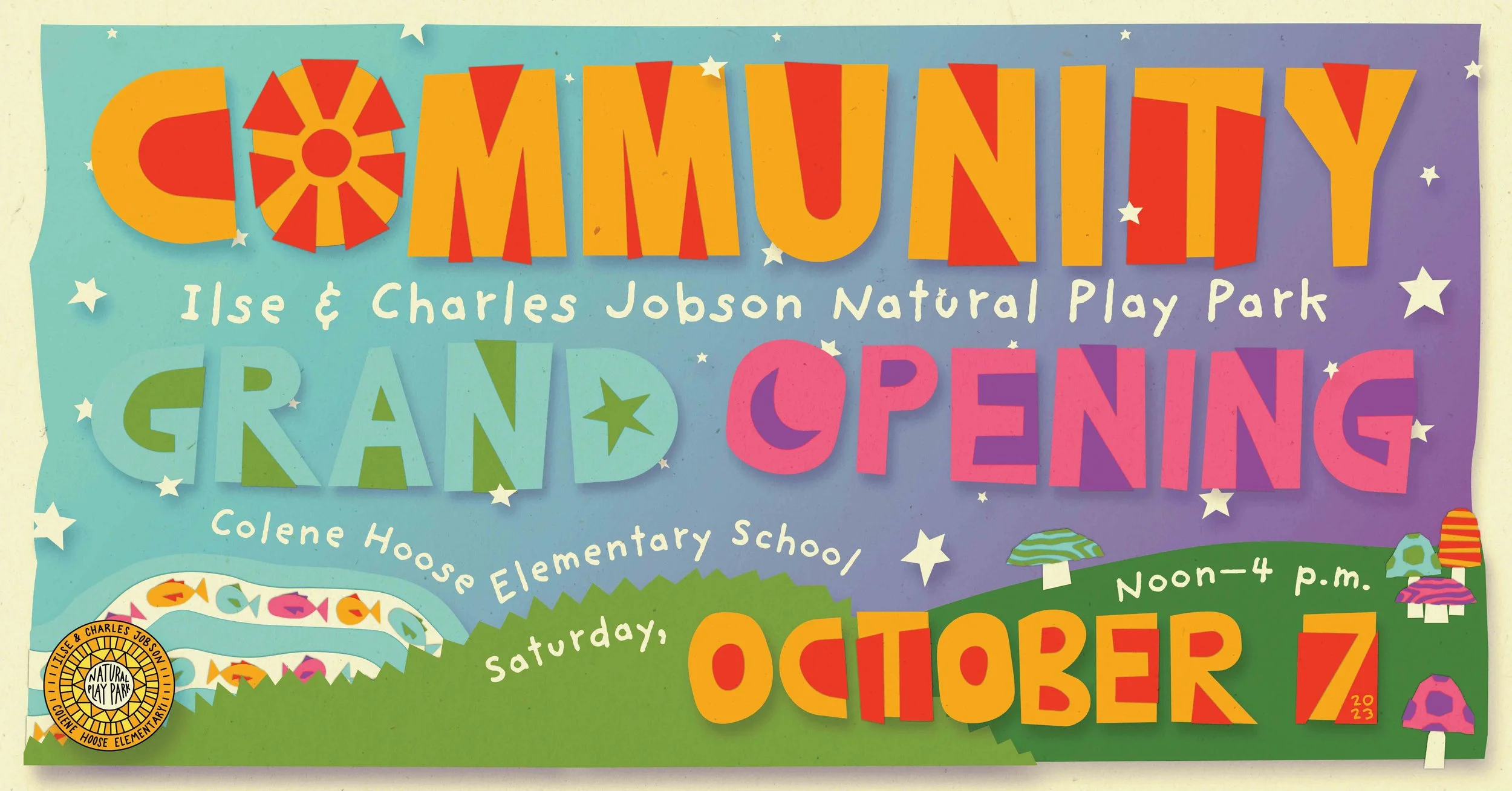
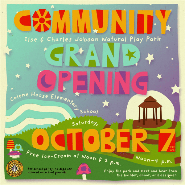
Park Grand Opening | 2023
“Inspired by the culmination of unique parts that make up the park, our poster aims to display the vast park as the wonderland of natural play that it is. We aimed to match the freeform nature of a childlike imagination by using craft materials and warm, inviting color palettes. With the help of these aesthetics, we portray some different elements of the park, like the Beaver Lodge gazebo, the winding mosaic fish river, the spiral of the Snail Hill, and even some of the signature wooden decorations found amongst the other attractions."
Collab with James McGurk // See originals on Instagram
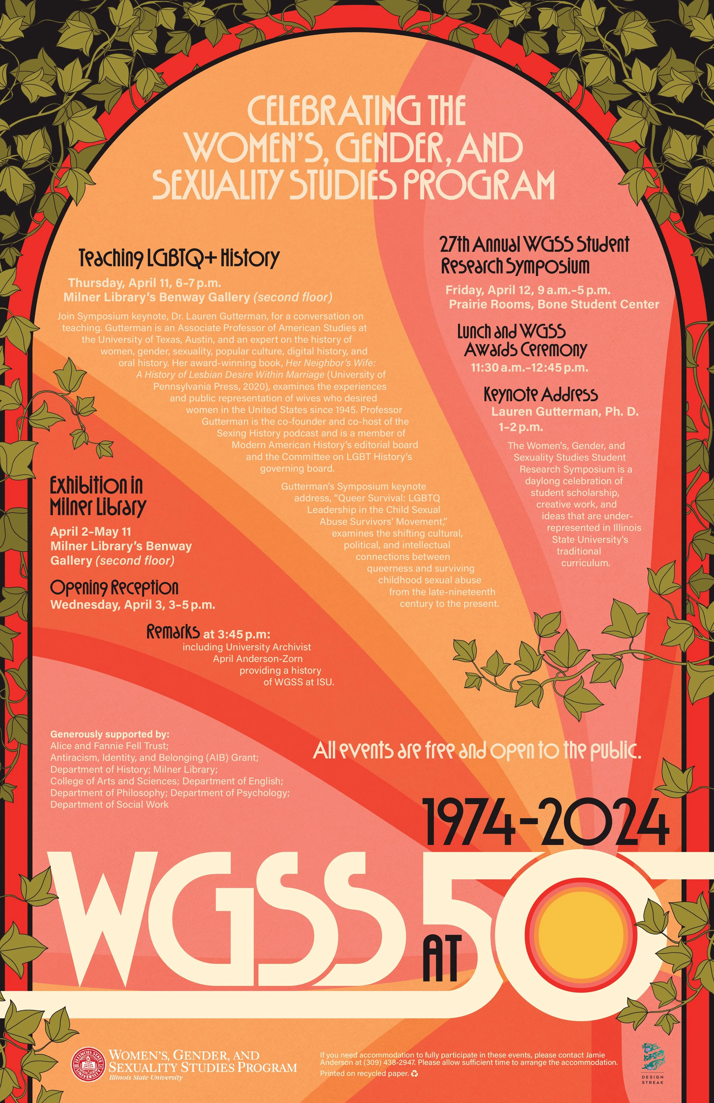
Women's, Gender, and Sexuality Studies 50th Anniversary | 2024
"The Women’s, Gender, and Sexuality Studies legacy is one to be celebrated. Throughout this poster, we commemorate all that the program has done and continues to do. The modernized retro styled font references the time-period in which the program originated and how the program continues to grow and evolve, taking charge of the ever-changing world around us.
The sunrays serve as a powerful symbol of enlightenment. Just as the sun's rays illuminate the world, WGSS illuminates students' understanding of identity, representation, and the complexities of gender and sexuality. The sunrays symbolize the ways in which WGSS sheds light on important issues, helping students to navigate and understand their own identities and roles within society. The frame around the sunrise symbolizes how the WGSS program educates students and helps them change the frame in which they see the world.
The ivy plant grows over any obstacles in its path and rarely stops. The ivy bordering the composition represents both the growth the program has endured throughout the years and how the curriculum is always adapting in response to world-wide events. Overall, every element on this poster represents and empowers the growing legacy of the Women’s, Gender, and Sexuality Studies program."
Collab with Anna Gsell & Hailey Marczak // CHOSEN DESIGN: see more collateral on Instagram
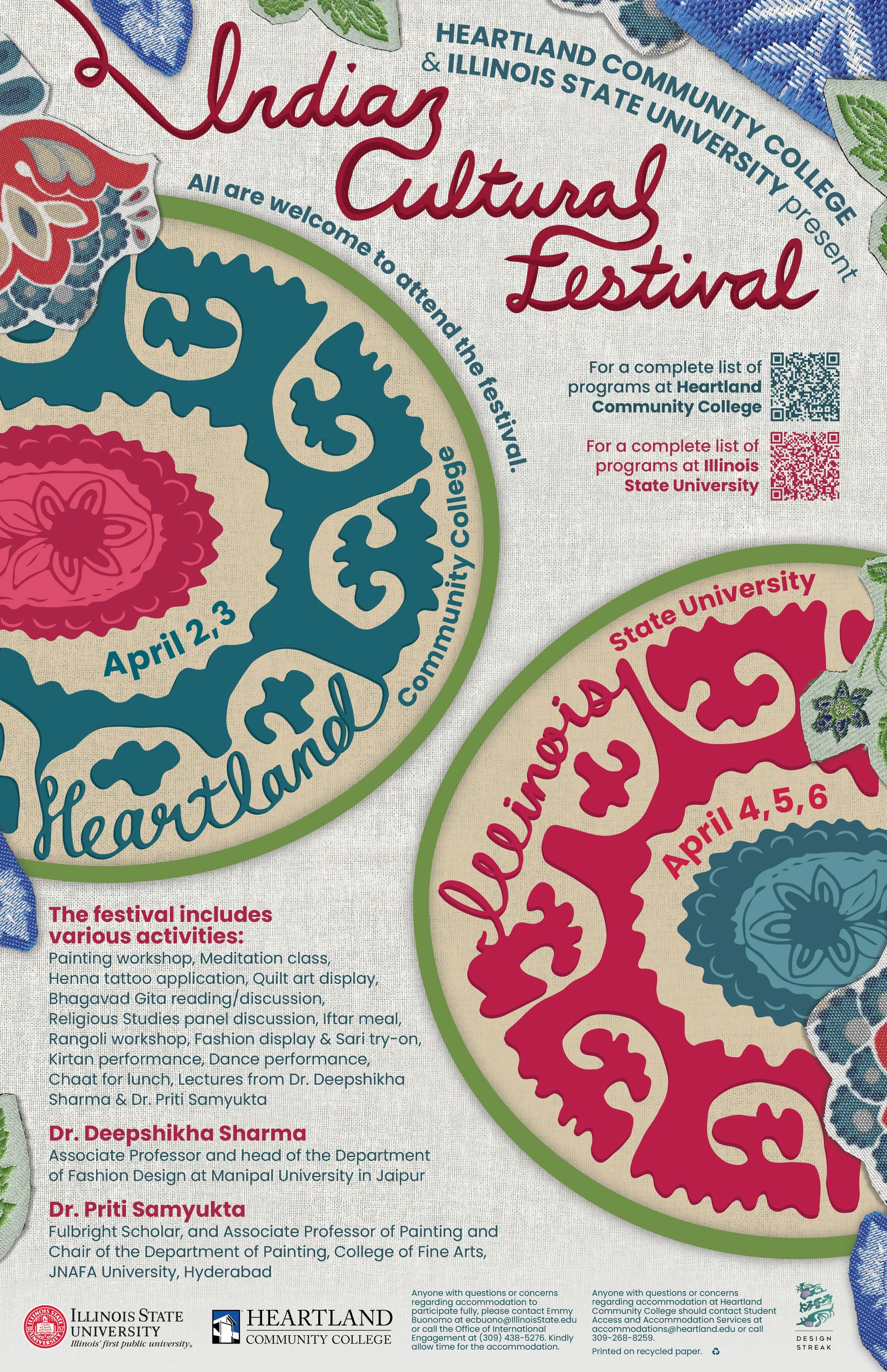
Indian Cultural Festival | 2024
"The Indian Cultural Festival celebrates the joys of Indian culture, featuring esteemed speakers with expertise in Indian art and textiles as well as various activities regarding art like painting, henna, quilting, and rangoli. This poster takes inspiration from Indian art, specifically the utilization of kalamkari and block printing, which represent both Illinois State and Heartland Community College as circular designs.
Prevalent in Indian block printing, these geometric motifs are often arranged in symmetrical compositions, creating intricate latticework designs. These shapes also reflect the influence of the Islamic art and architecture of the region. Each motif is meticulously crafted, with multiple scans of fabric capturing the textures and ornamental flourishes of Indian floral patterns, showcasing the profound influence of textiles and flowers like jasmine in Indian heritage. The titles feature hand-drawn typography, which resembles delicate embroidery and adds a tactile dimension to the poster, mirroring the intricate craftsmanship found in Indian textiles. Additionally, the font Poppins is used for the other text. Created by the Indian Type Foundry, Poppins represents the marriage of two cultures.
Vibrant colors were carefully selected to symbolize the exuberance of the festival, drawing from the colors found in traditional Indian fabrics. Red and pink hues evoke notions of love and fertility. Shades of blue represent the personification of space and vastness, associated with Krishna, a revered Hindu deity. The inclusion of green signifies new beginnings, encapsulating the spirit of the festival as a platform for cultural exchange and exploration. Moreover, the incorporation of red and blue pays tribute to the colors synonymous with Illinois State and Heartland Community College, blending local identity with the global celebration of Indian culture. "
Collab with Anna Gsell & Hailey Marczak // CHOSEN DESIGN: see more collateral on Instagram
Jobson Family Foundation Logo | 2024
The Jobson Family Foundation’s goal is to connect communities using education, free play, and nature. The mosaic represents how everyone is a smaller piece needed to come together and create the big picture, which is the best possible future. The circle shape represents the idea that everyone is equal in this process. There is an oak leaf in the negative space; it symbolizes strength and longevity, inspiring this foundation and its mission to stand the test of time. The oak is also the Illinois state tree, reminding us of our roots. The seasonal colors reflect that free play is year-round. The underlying message of this logo is that we are the foundation for the future, and each of us plays an equal role in it.
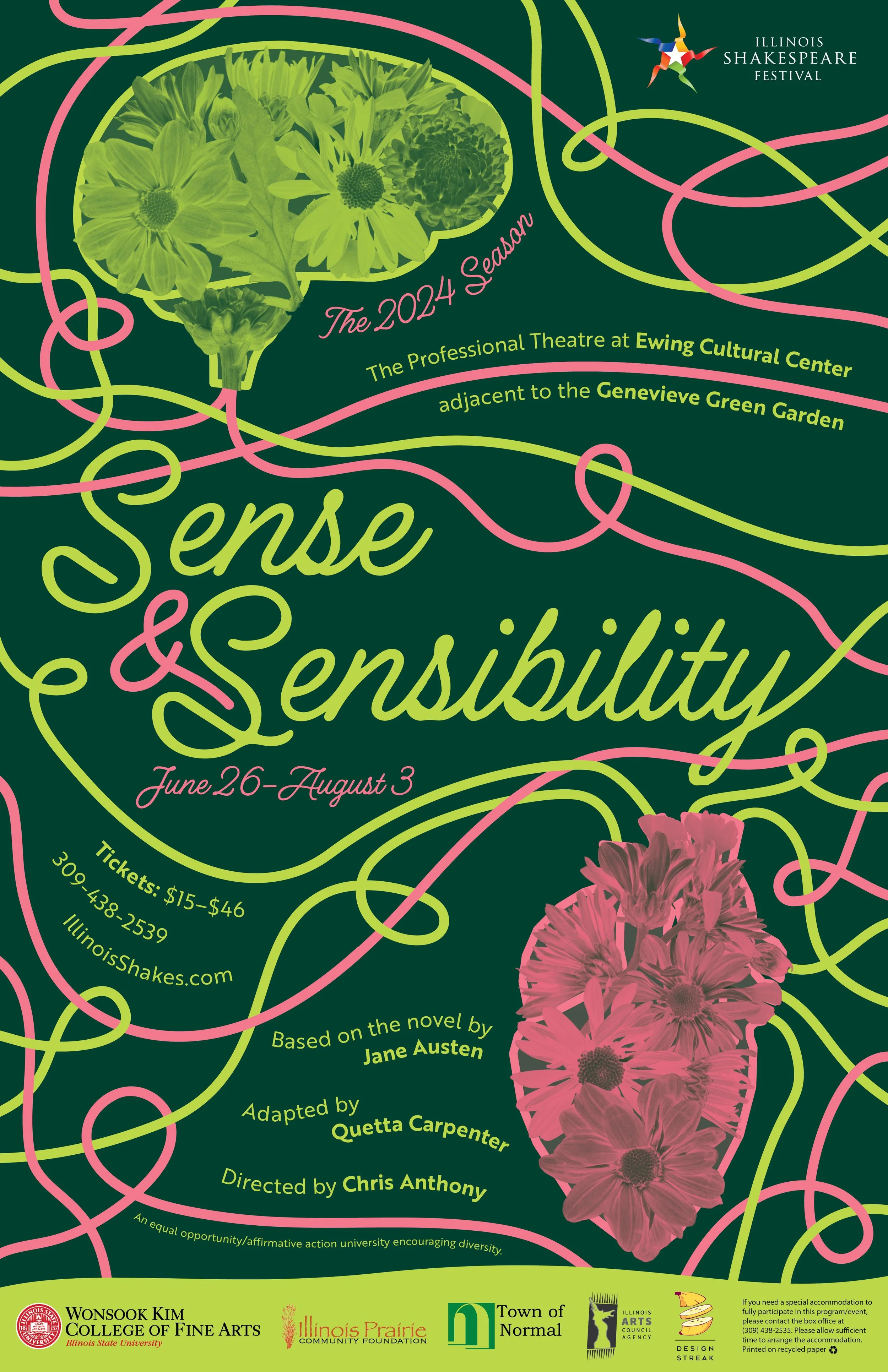
Illinois Shakespeare Festival – S&S Poster | 2023
“The concept behind this poster was to rely heavily on the dichotomy of loving and getting married based on what your head wants, versus what your heart wants. I leaned into this and used tones of complementary colors such as green and red. The green symbolizes money and getting married for your head, while the pink symbolizes blood and getting married for your heart, as well as the entanglements of the red string of fate. The flowers are individually scanned in and represent both the nature found throughout and the ‘feminine’ energy of the play. The script font and additional lines symbolize how messy yet elegant and beautiful love is.”
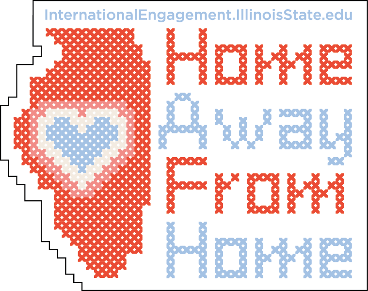
OIE Sticker | 2023
"When we talked with international students, they relayed how helpful the Office of International Engagement has been during their transition to Illinois State University. During our discussion, one phrase that stuck out to me was “Home Away From Home.” With this sticker, I wanted to emulate the look of cross-stitch pillows that say a similar phrase, “Home Sweet Home.” The colors are soft, welcoming shades of blue and red. This sticker is a reminder to students that even though this may not be their actual home, they will always have a second home at Illinois State.”