Loyola University Chicago
2025–Present
"[Loyola is] Chicago's Jesuit, Catholic University - a diverse community seeking God in all things and working to expand knowledge in the service of humanity through learning, justice, and faith."
Working at Loyola has provided me with the opportunity to work on a variety of projects, for a wide range of clients. Below is a selection of those projects.
Learn more about Loyola at www.luc.edu and www.luc.edu/mission/about.
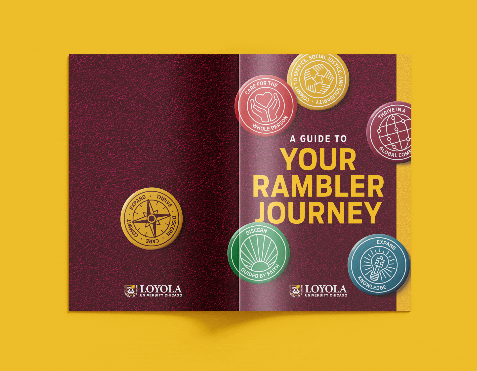
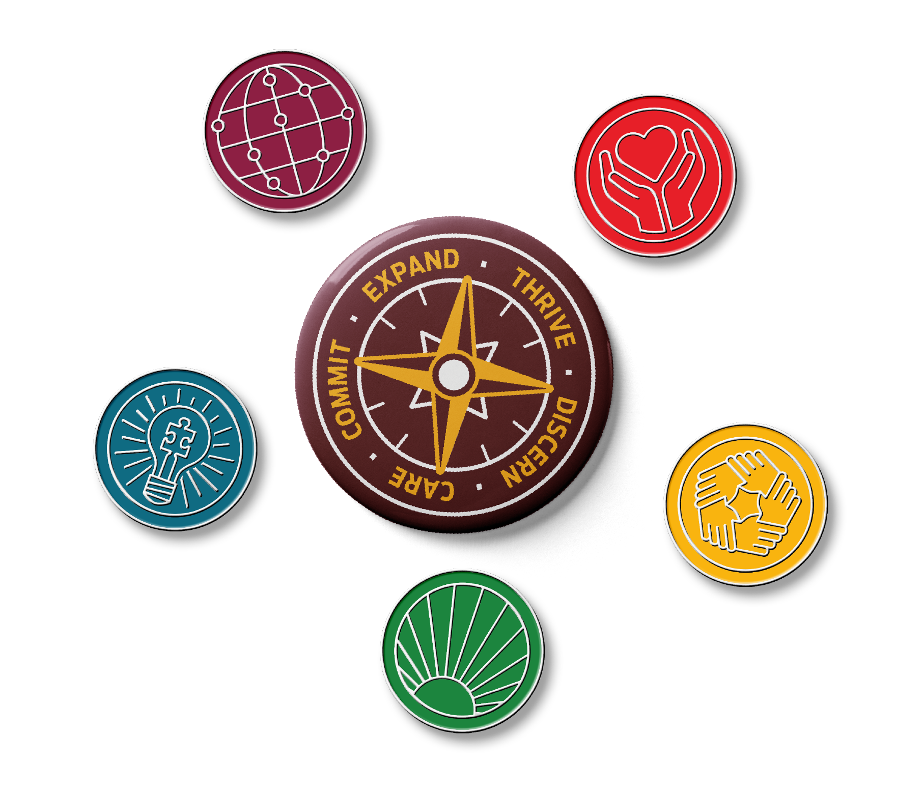
Your Rambler Journey | 2025–Present
The Creative Team was tasked with reviving, updating, and rebranding the student experience, previously known as Engage Loyola.
What started as a booklet design, grew into buttons, lapel pins, a stole, and digital assets. As of now, Your Rambler Journey is still evolving and growing.
Learn more about the Loyola student experience and visit the program’s accompanying website at www.luc.edu/ramblerjourney.
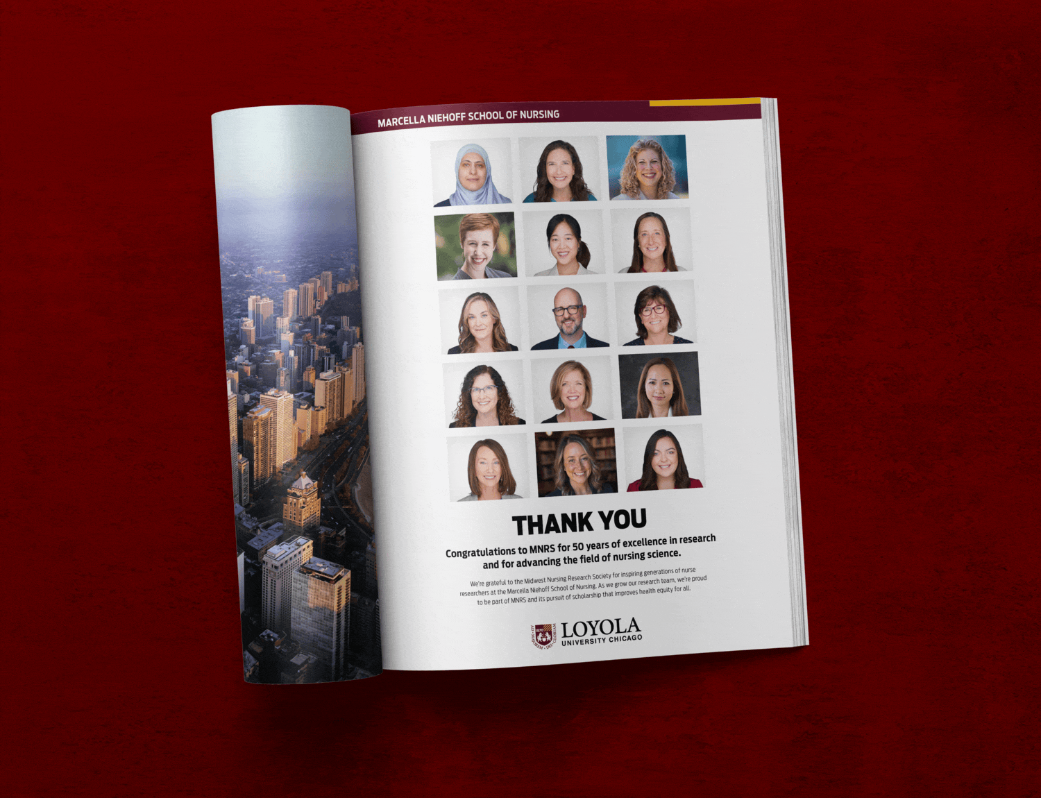
Print Ads | 2025–Present
A recurring project type is to create print ads for the various schools and programs on campus. The ads range from a full- to half-page in size and are commonly used in purchased ad space within a magazine or brochure. Unless specified, ads should follow a similar template and layout.
Quinlan Reputational Ranking Brochure | 2025
During the fall 2025 semester, the Quinlan School of Business dean came to us wanting to do a campaign prior to the Graduate ranking season. The campaign included a mailing piece, 5 sets of digital ads, news stories, and an updated website. The Creative Team was in charge of the mailing piece and the digital ads. The entire team pitched in with the digital ads, but I was asked to help spearhead the print piece.
The dean shared a few reputational mailers from other schools he had saved as inspiration. After the initial meeting, Quinlan’s MarCom manager provided us with rough copy to help us brainstorm and use as initial placeholder text.
I presented a handful of options, including an accordion fold, an advent/door fold, a gate fold, and a pop-up option. The dean was immediately taken with the advent calendar idea, although he asked us to hold onto the other options for later and brought back the gate fold for the undergraduate rankings piece in spring 2026. Due to the nature of the piece, we had to create the actual print piece and a fly sheet for mailing.
Miscellaneous | 2025–Present
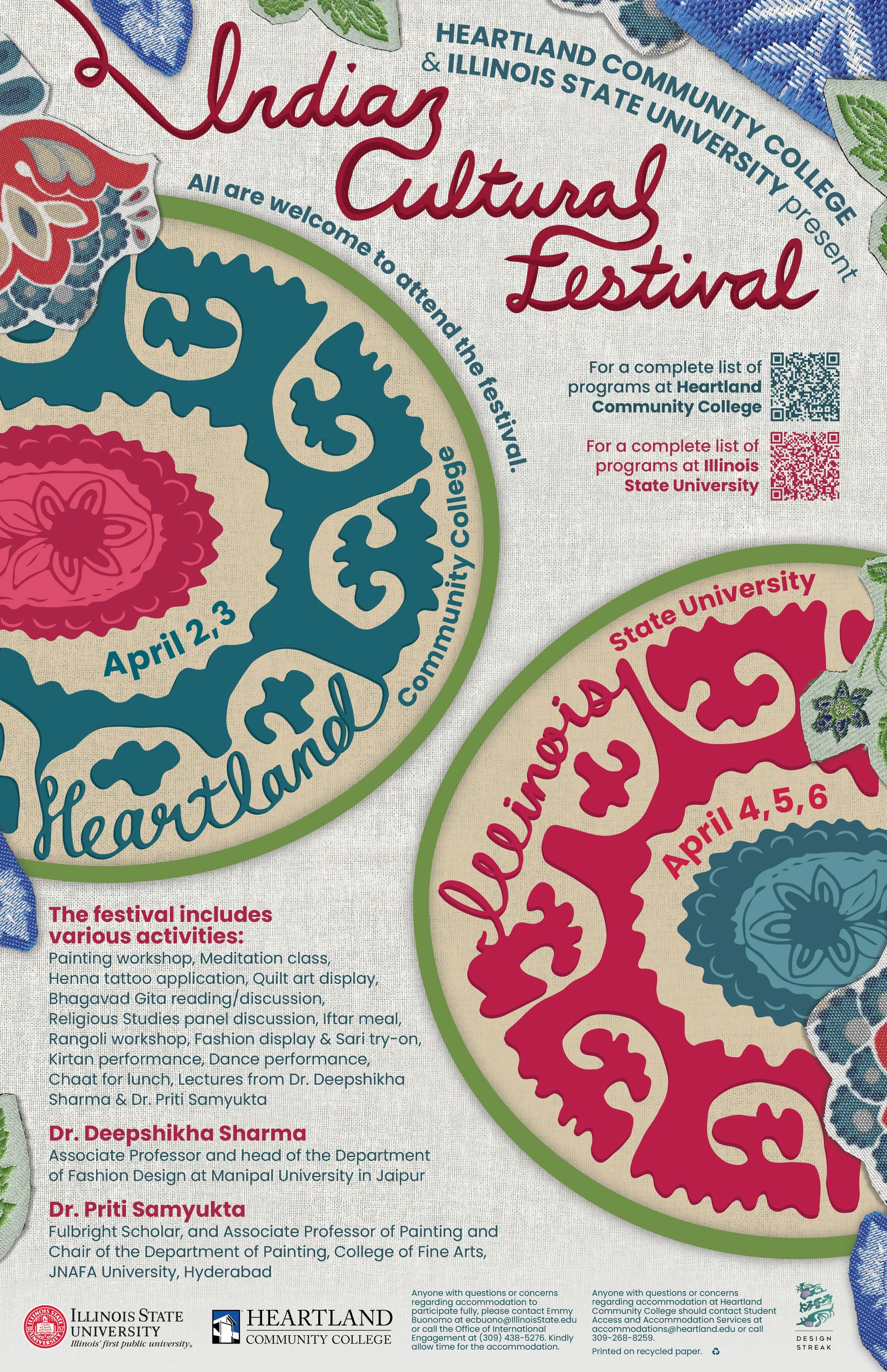
"The Indian Cultural Festival celebrates the joys of Indian culture, featuring esteemed speakers with expertise in Indian art and textiles as well as various activities regarding art like painting, henna, quilting, and rangoli. This poster takes inspiration from Indian art, specifically the utilization of kalamkari and block printing, which represent both Illinois State and Heartland Community College as circular designs.
Prevalent in Indian block printing, these geometric motifs are often arranged in symmetrical compositions, creating intricate latticework designs. These shapes also reflect the influence of the Islamic art and architecture of the region. Each motif is meticulously crafted, with multiple scans of fabric capturing the textures and ornamental flourishes of Indian floral patterns, showcasing the profound influence of textiles and flowers like jasmine in Indian heritage. The titles feature hand-drawn typography, which resembles delicate embroidery and adds a tactile dimension to the poster, mirroring the intricate craftsmanship found in Indian textiles. Additionally, the font Poppins is used for the other text. Created by the Indian Type Foundry, Poppins represents the marriage of two cultures.
Vibrant colors were carefully selected to symbolize the exuberance of the festival, drawing from the colors found in traditional Indian fabrics. Red and pink hues evoke notions of love and fertility. Shades of blue represent the personification of space and vastness, associated with Krishna, a revered Hindu deity. The inclusion of green signifies new beginnings, encapsulating the spirit of the festival as a platform for cultural exchange and exploration. Moreover, the incorporation of red and blue pays tribute to the colors synonymous with Illinois State and Heartland Community College, blending local identity with the global celebration of Indian culture. "
Collab with Anna Gsell & Hailey Marczak // CHOSEN DESIGN: see more collateral on Instagram